Similar Projects
See All Work
The Transfermarkt platform is a free-to-use online hub for global statistical data on everything football-related. The website has, on average, around 39 million unique monthly visitors and hosts information ranging from transfer news, fixtures and football schedules to the financial details of player and club expenditure. Despite being around since the early 2000’s, the design of the platform has stagnated, probably due to the effort it would take to overhaul a platform with such a large database of information.
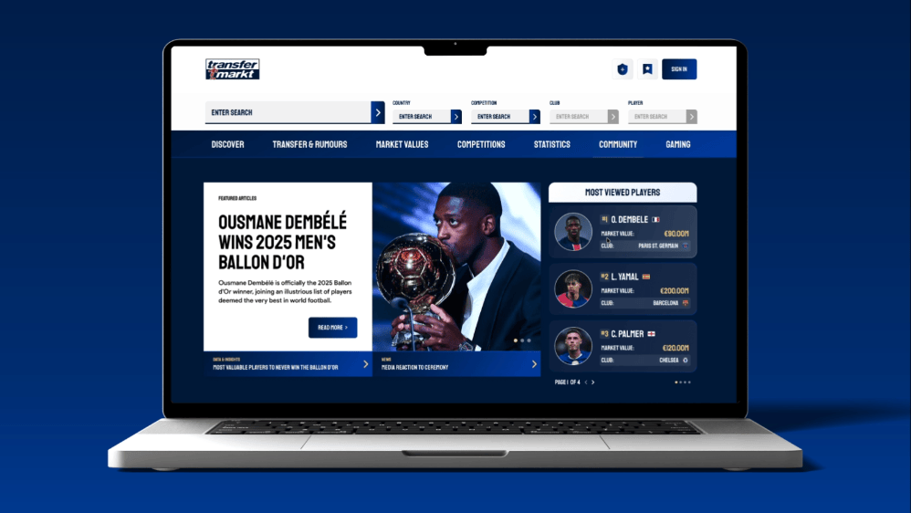
As someone who regularly uses the platform, I decided to try my hand at conceptually re-designing a page of their website to test how challenging it would be to balance the integration of dynamic, crucial data within a refreshed, visually appealing UI.
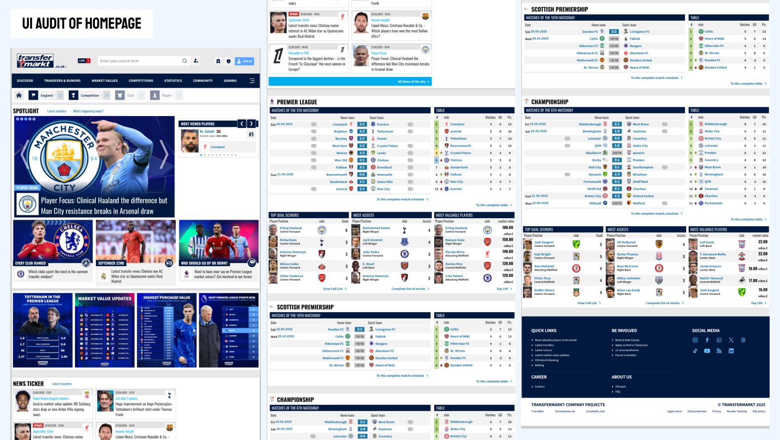
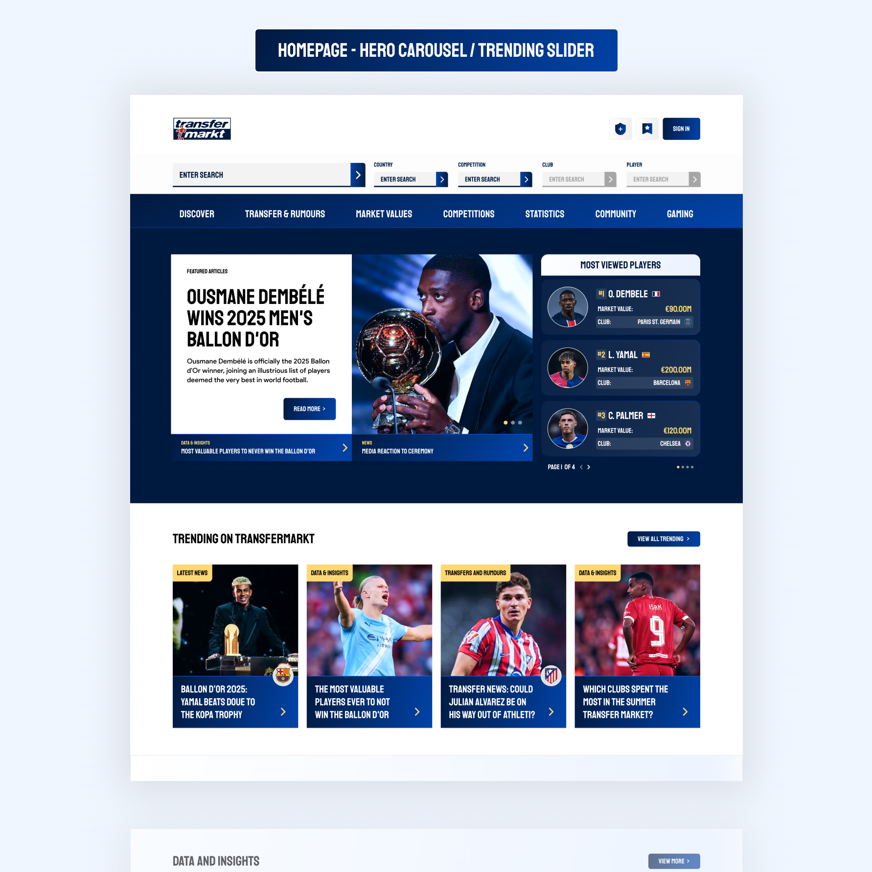
As with any redesign, I had to start off with a UI audit to assess the breadth of what I was working with and to also begin to map out the key components that would need to feature and where they would be positioned on the page. A takeaway I found from this was that, despite feeling blocky and outdated on table and card elements, there was a strong branding effort for some of the static graphics that were featured on the website. My plan was to use elements like the strong, varying blue gradients and bold imagery as a starting point of reference for the redesign, to establish a consistent theme going forward.
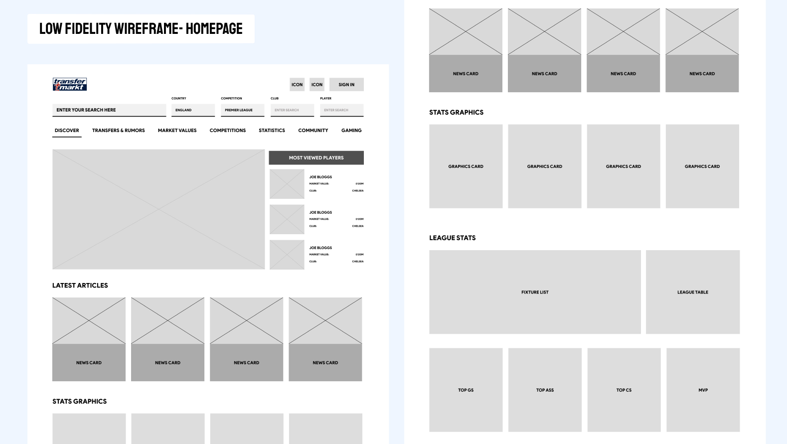
From the audit, I was able to create a simplified site map to plan where components would sit on the page. It was at this point that I decided to only focus on the homepage in the desktop layout, given the time constraints and it being a purely conceptual and self-initiated project.
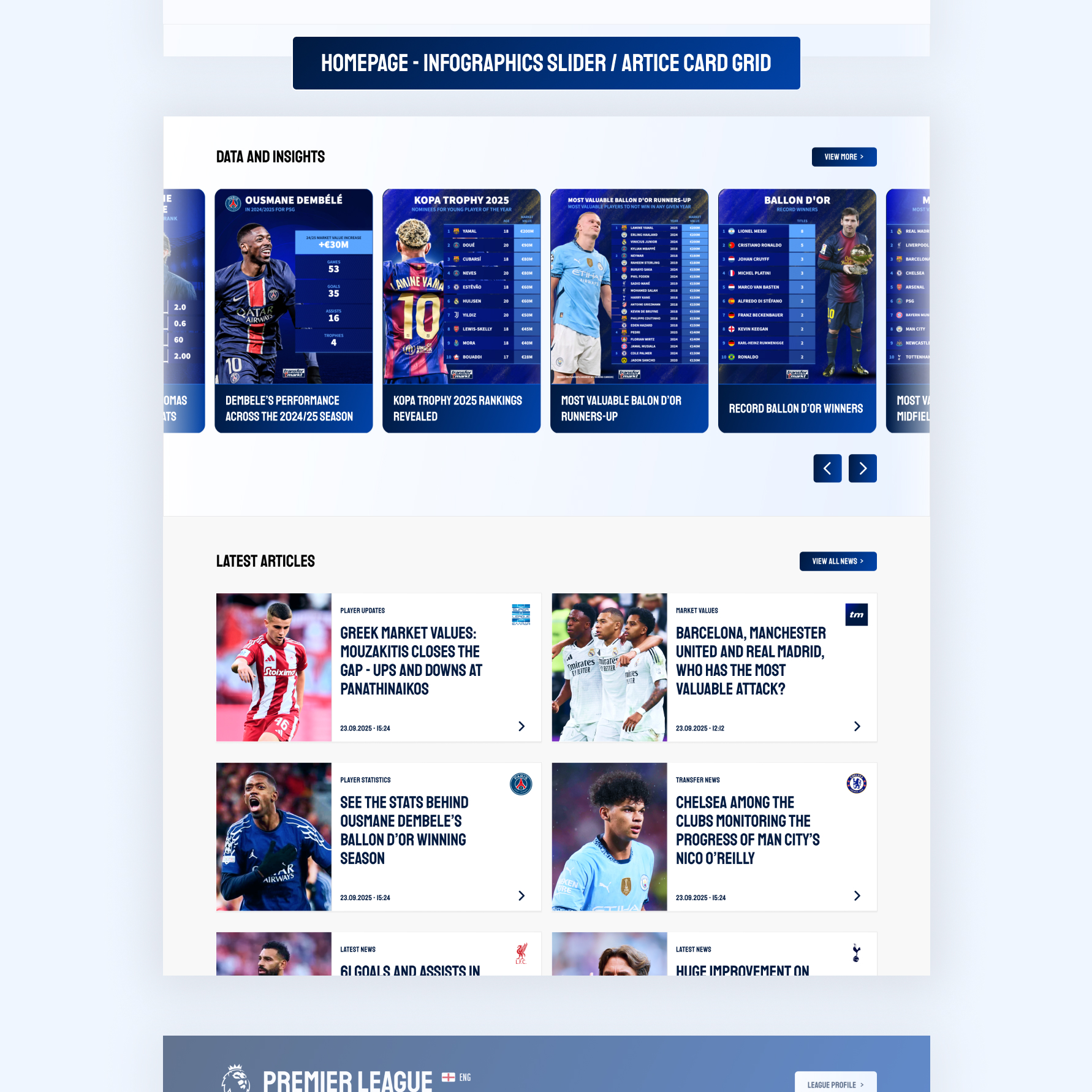
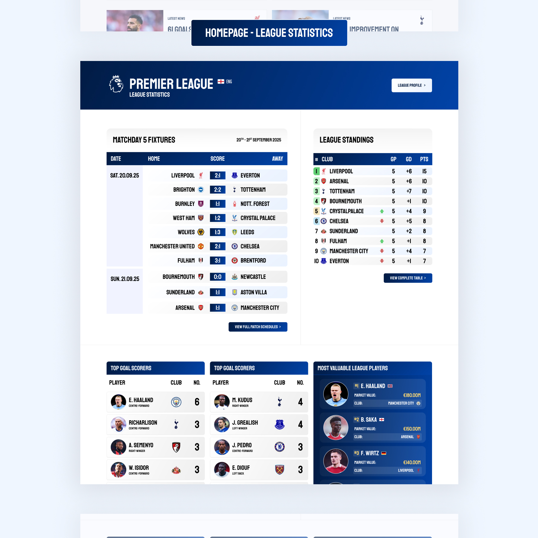
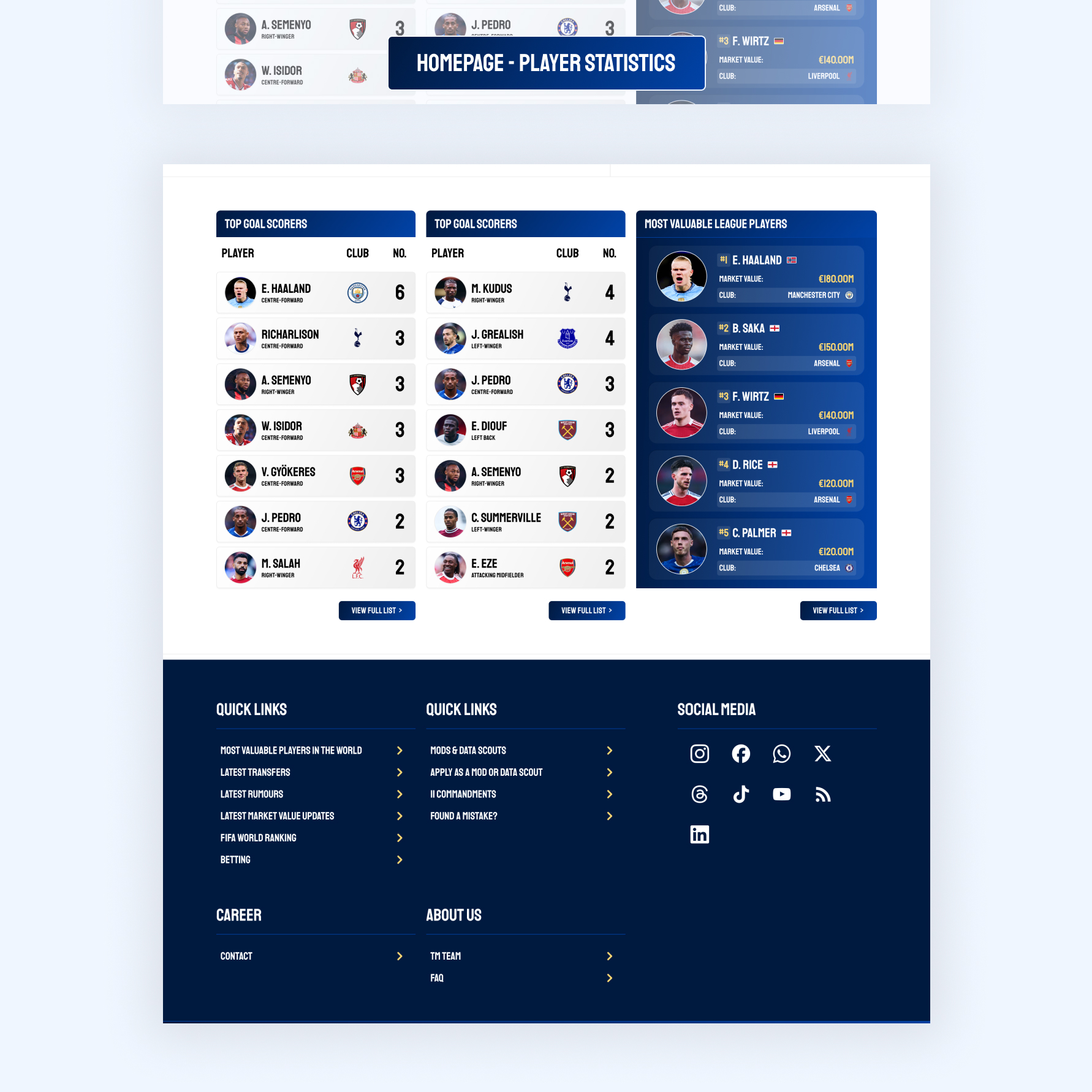
Off the back of the UI audit, I was able to target the key components I needed to work on during the redesign. Despite the layout adding visual complexity, the components on the homepage that held the statistical data were relatively straightforward, consisting of a series of cards, sliders and table modules. With this in mind, I set out to build a mini UI component system in high-fidelity that I could use to flesh out the rest of the homepage.
After setting a visual tone with the component system, I proceeded to map out how each element would sit across the homepage, ensuring that each section retained the same original function. I didn’t want to mix and match the ordering of the sections or implement new journeys that allowed the users to navigate through the site in different ways; I wanted to focus solely on the UI to avoid breaking that familiarity.
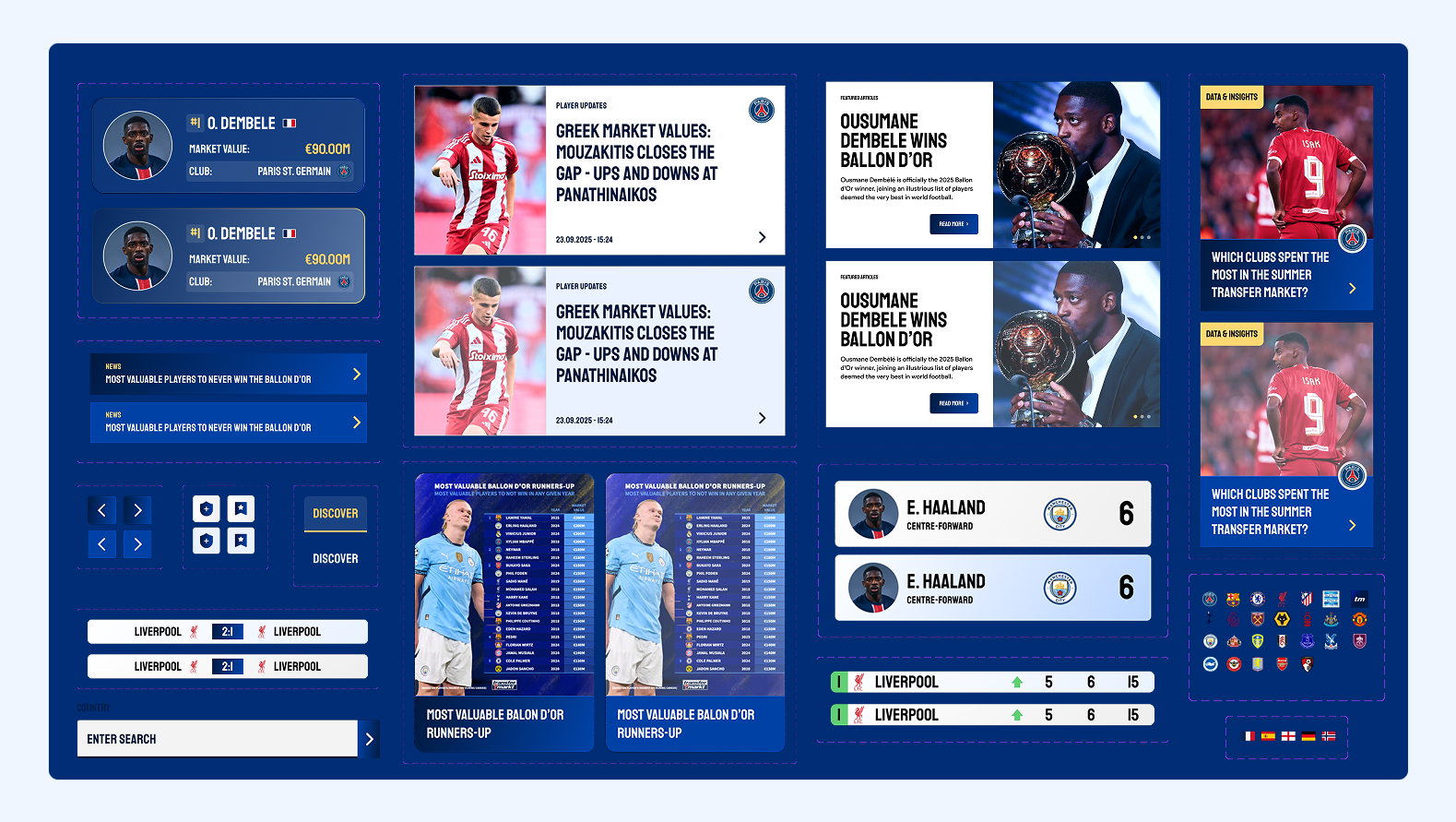
I chose instead a layout that gave more breathing space and decluttered the sections that I felt were sitting on top of each other. I boldened cards, added a modern, sports-style font pairing (Staatliches and Product Sans) and tried to align the contrast and sizes with accessibility standards, making information easier to extract from each component in turn.
I leaned into improving player imagery to make the statistical sections seem more engaging, increasing the size and style of player and stat cards to make the information feel more game-like. I felt the added dynamism would appeal to the modern football fan more so and closely align better with other platforms that host football stats and data, like the Premier League Fantasy app and Squawka.
My main goal was to help “lift” the information/data off the page and to create a modernised feel to the platform. Where I do believe a large case study/design would need much more stress testing across varying device sizes (tablet and mobile) and additional pages, I believe this was achieved on the home page at least, and could be an interesting starting point to begin live redesign off if an opportunity were to arise.