Similar Projects
See All Work
CX Ninjas had grown into a recognised customer experience education and enablement business, but their brand and digital presence no longer reflected the depth or maturity of their offering. The existing identity felt visually inconsistent and struggled to scale across digital touchpoints, while the website lacked clarity in how services, value, and expertise were communicated.
There was a need to establish a clearer brand direction that could support growth, improve credibility in a competitive CX and SaaS landscape, and create a stronger foundation for both marketing activity and digital delivery.
The project began with a brand and website audit to establish a clear starting point. This included reviewing existing brand assets, messaging, and digital touchpoints, alongside visual comparisons with adjacent and aspirational competitors in the CX and SaaS space. The aim was to identify gaps in clarity, consistency, and differentiation, rather than to redesign in isolation.
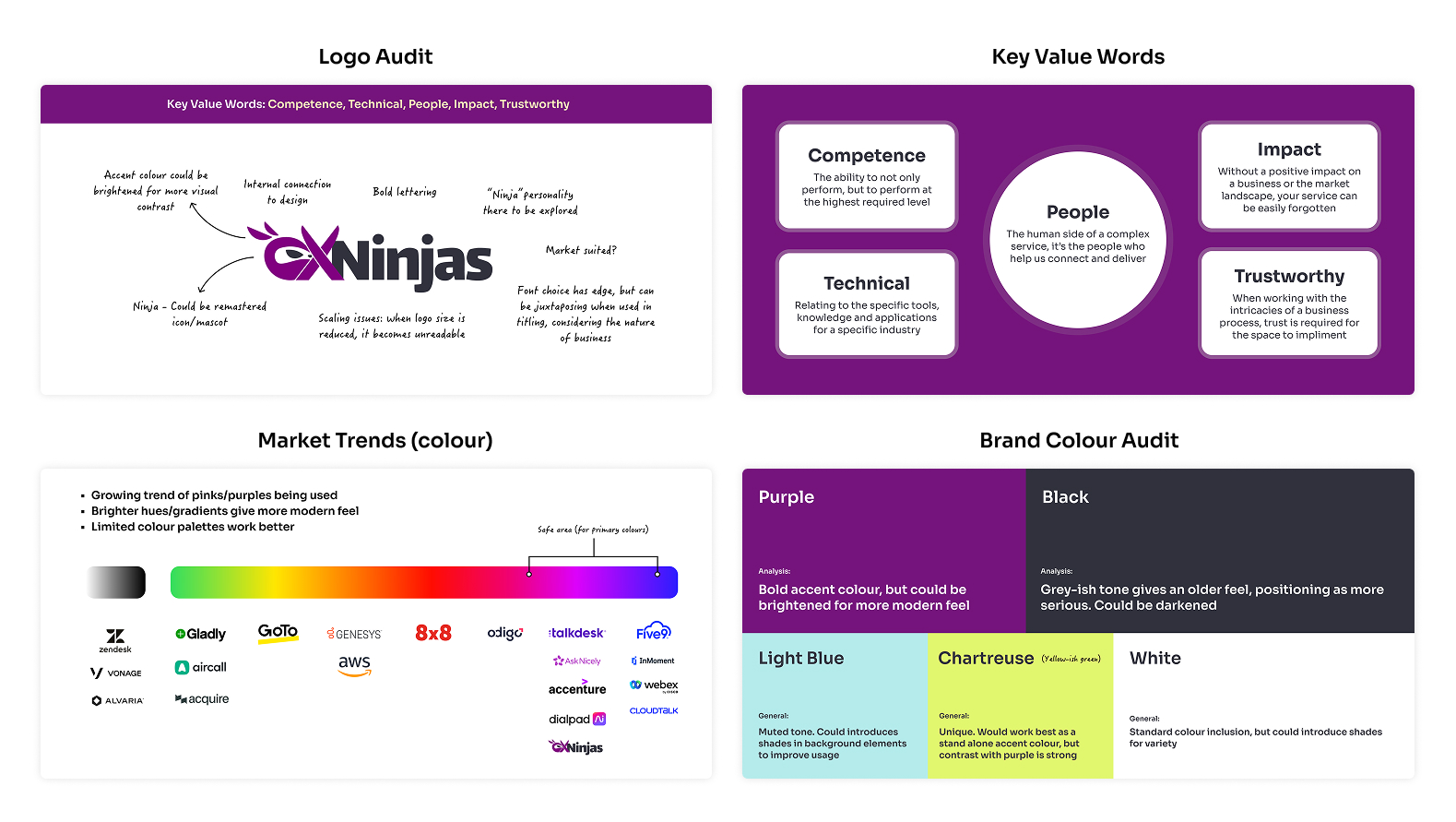
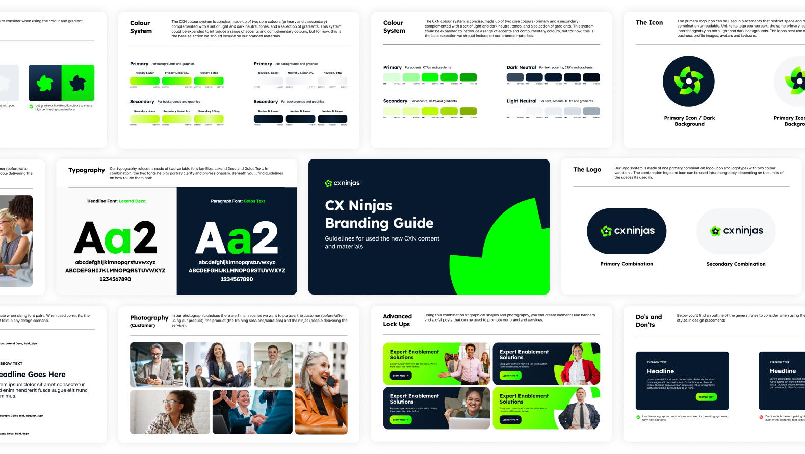
From this, I developed a series of structured branding routes that explored three different strategic positions for the brand, ranging from more conservative and professional to more expressive and distinctive. The first route, Conform, was designed to match the traditionally “safe” style expectations of brands in the CX markets. Balance was designed with more design edge, and Disrupt was intended to break industry conventions. Each route considered logo direction, colour systems, typography, messaging tone, and how the brand could translate across digital products, marketing materials, and training assets.
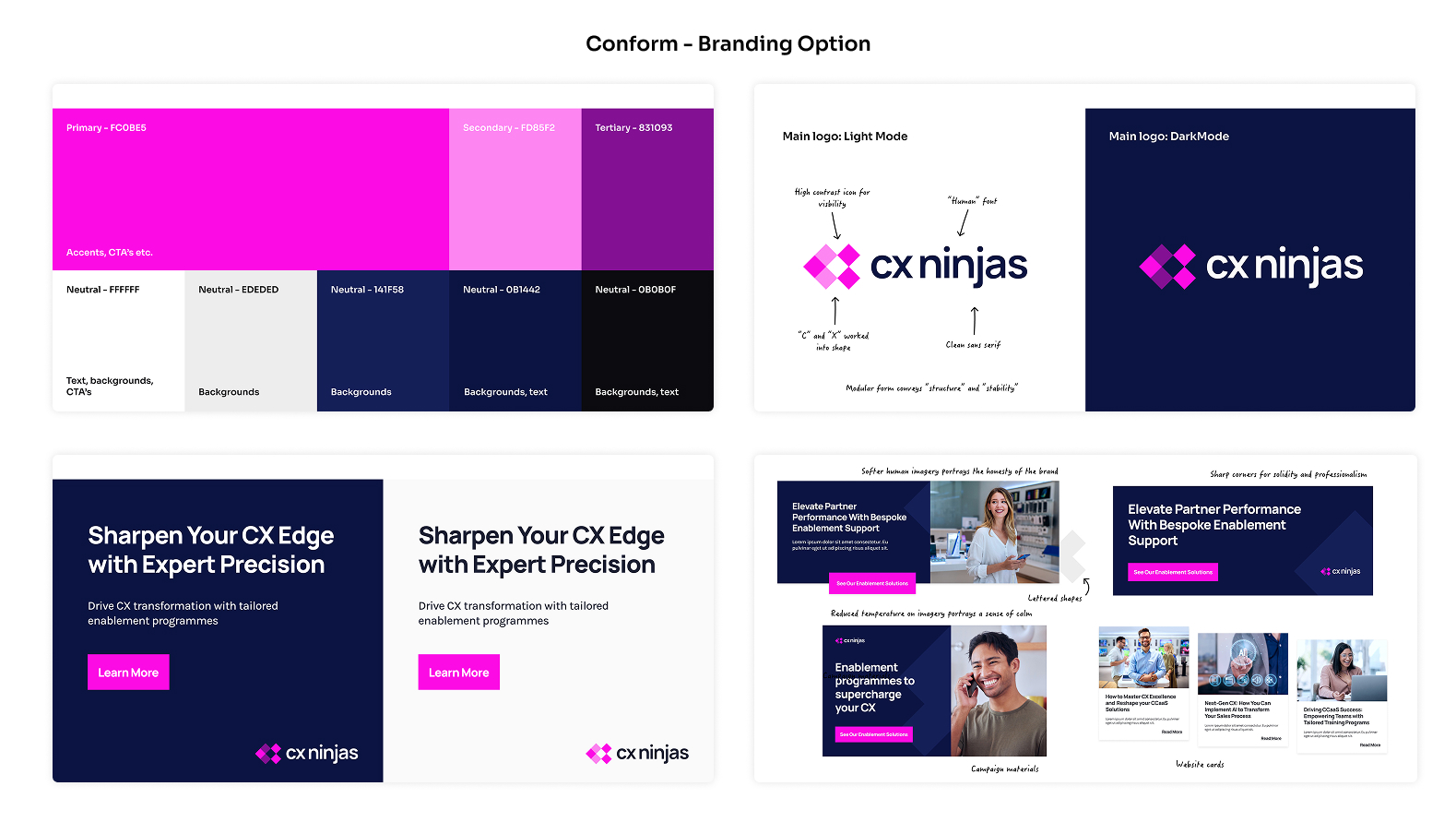
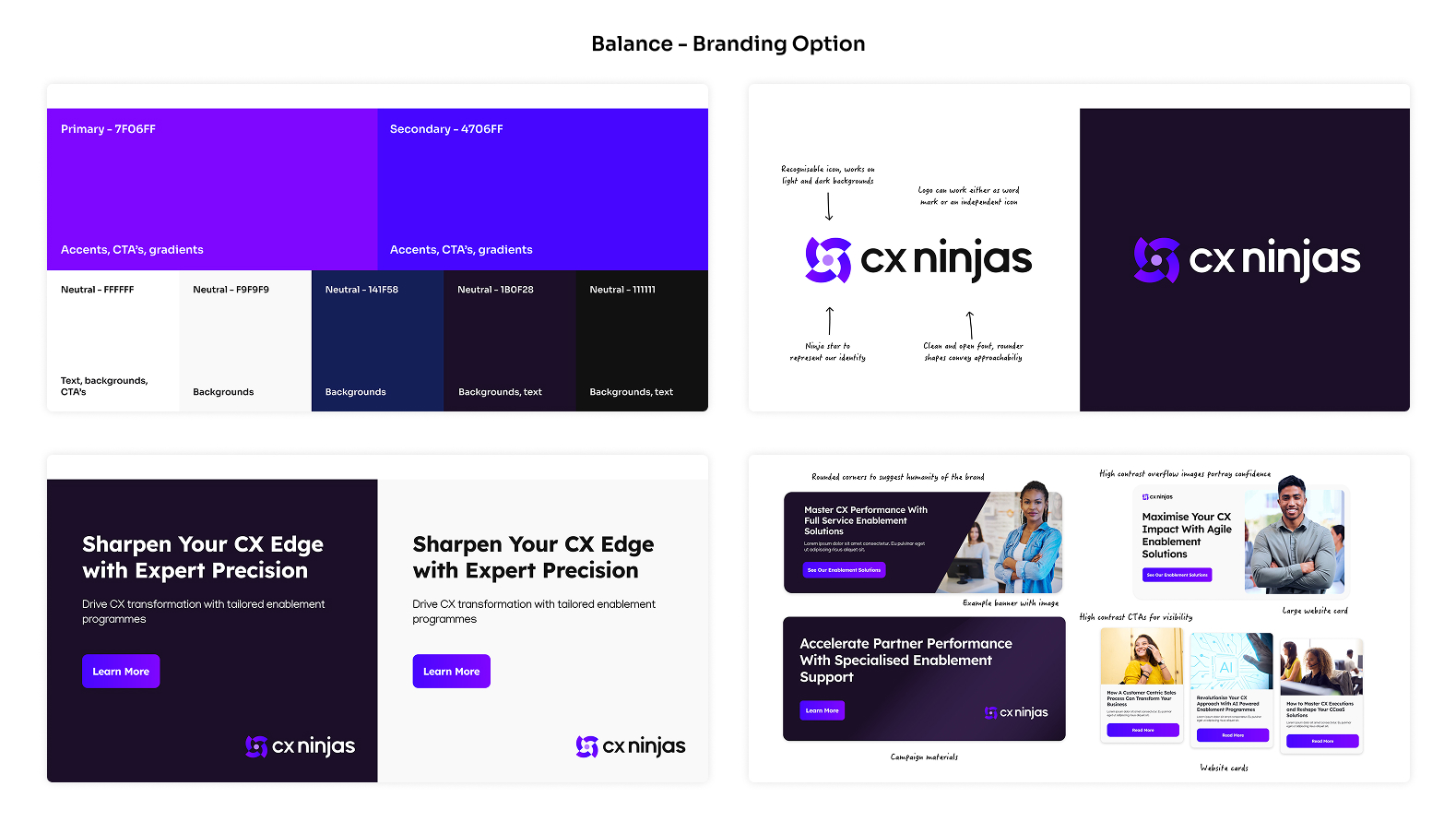
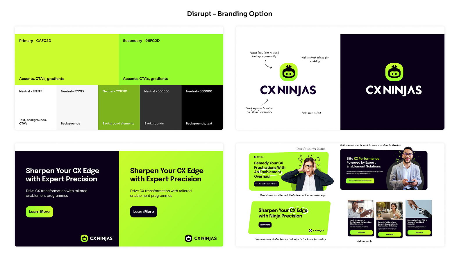
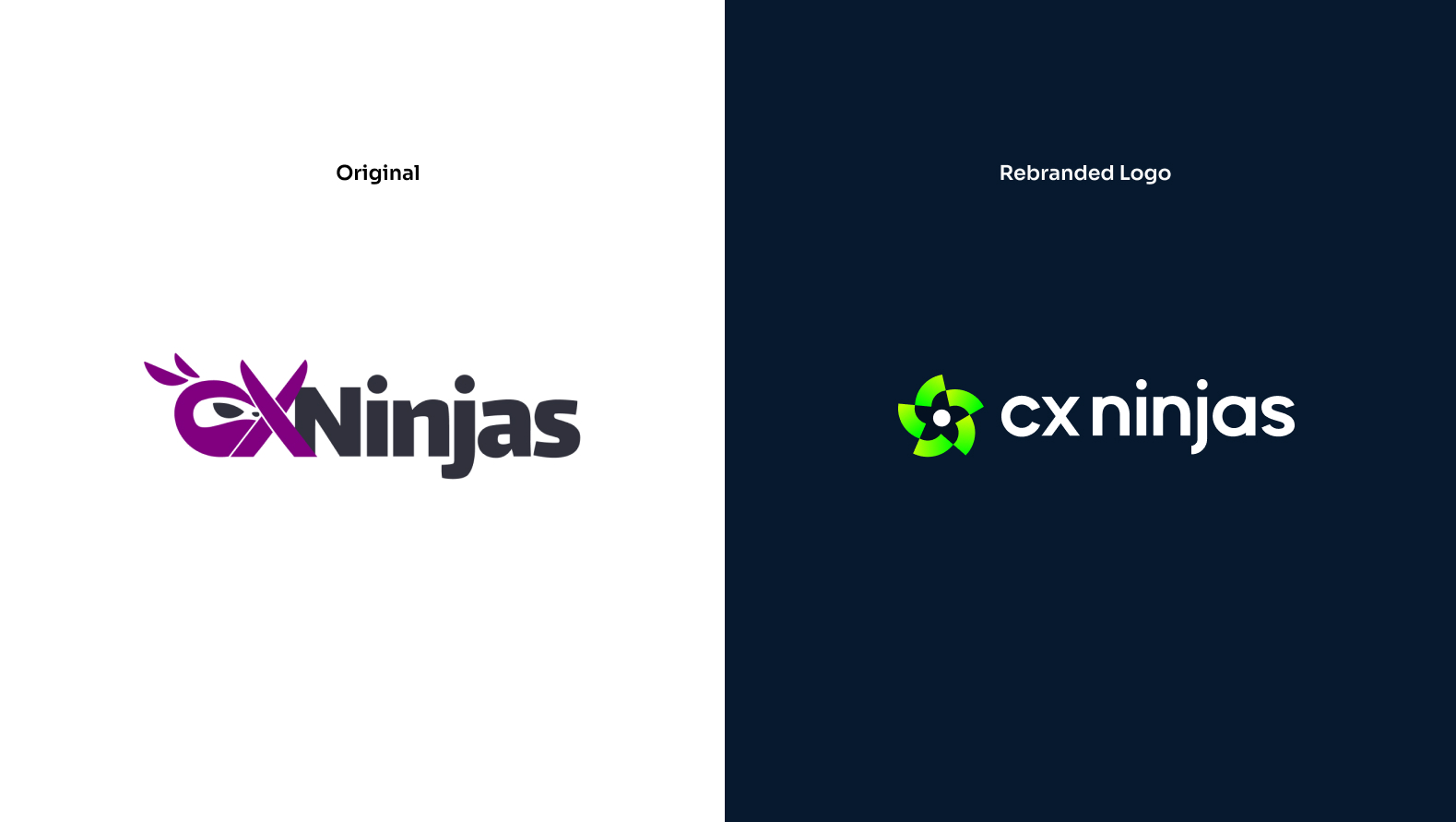
From feedback I presented the options to key stakeholders within the company and, based of their feedback, was able to finalise a single design route for the brand. The final choice was based off a combination of both Disrupt and Balance options, merging the colour contrast and visual edge with some of the more traditional, yet modern features of the Balance route. From this, I was able to finalise the brand mark before extending assets to create a refreshed branding system that would house all the components of the new identity.
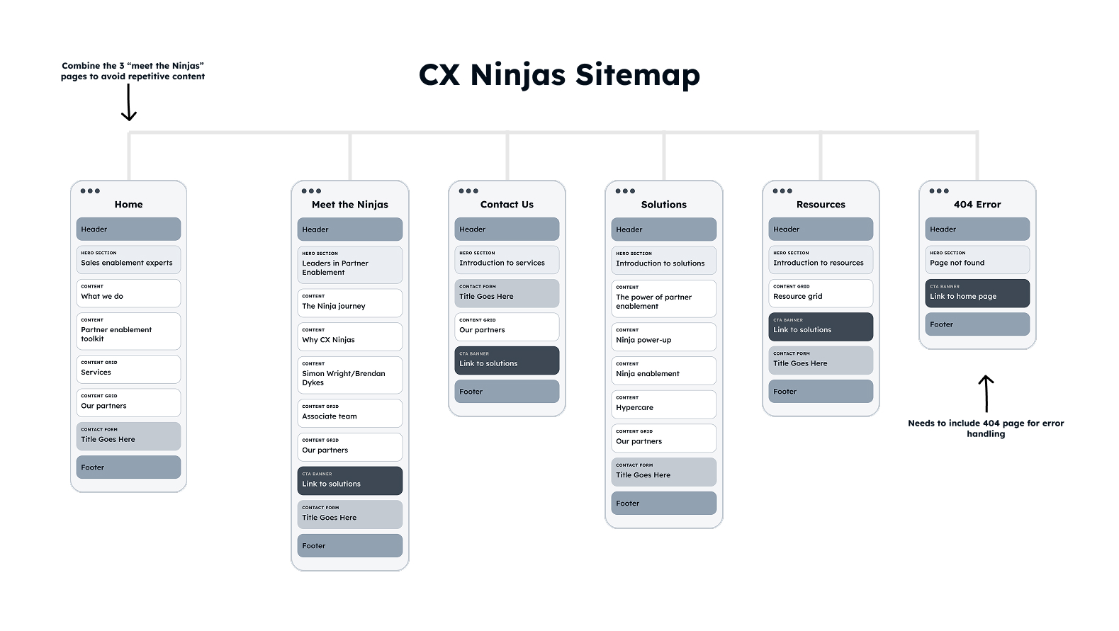
With the success of the refreshed branding system, I had the foundations needed to extend the identity across other business platforms. The next opportunity was to address the company website, which contained broken navigational links, outdated visuals, and unclear messaging. I began with an audit, then developed a site map to understand the content order of each page, aiming to streamline the structure to include only necessary components.
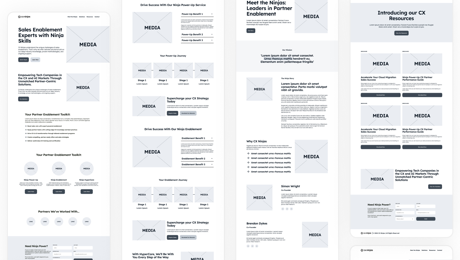
With the constraints understood, I developed the site map into a set of low-fidelity wireframes to define the UX and identify gaps in key user journeys. These were discussed internally with a WordPress developer and key stakeholders to ensure we hadn’t missed any gaps in the website build planning. The objective was to relaunch a marketing website that showcases their new branding identity, so the component or proposed website feature had to align with that.
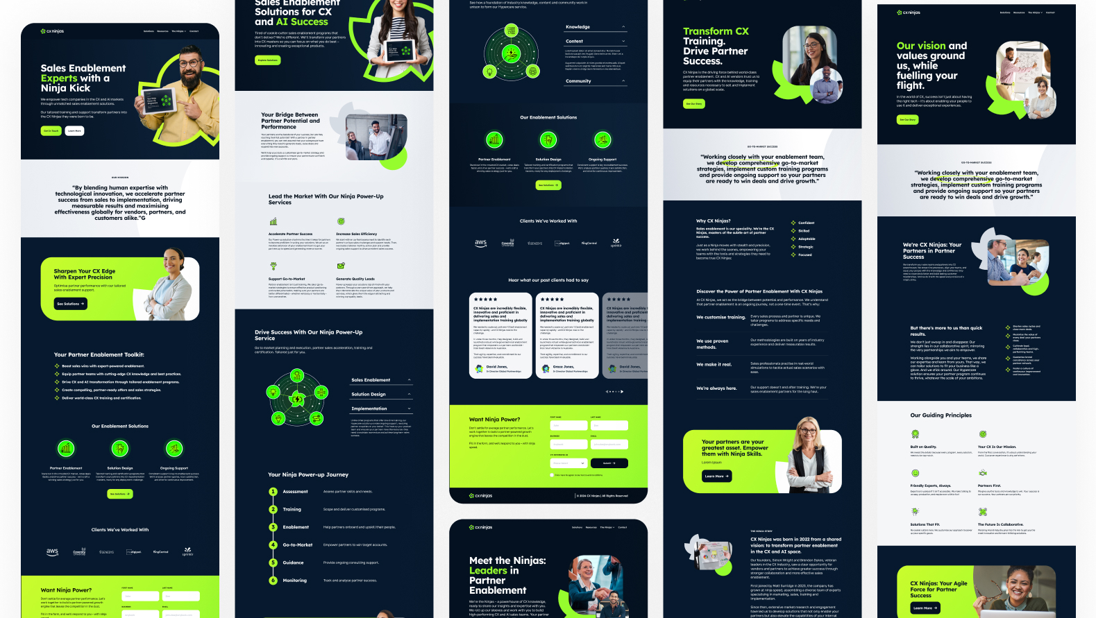
Having signed off on the low-fidelity wireframes, I created a Figma-based component system and a set of high-fidelity wireframes that defined layout, hierarchy, and interaction patterns. These wireframes extended the new brand identity into a cohesive digital experience and were used as a reference point for the live site rebuild.
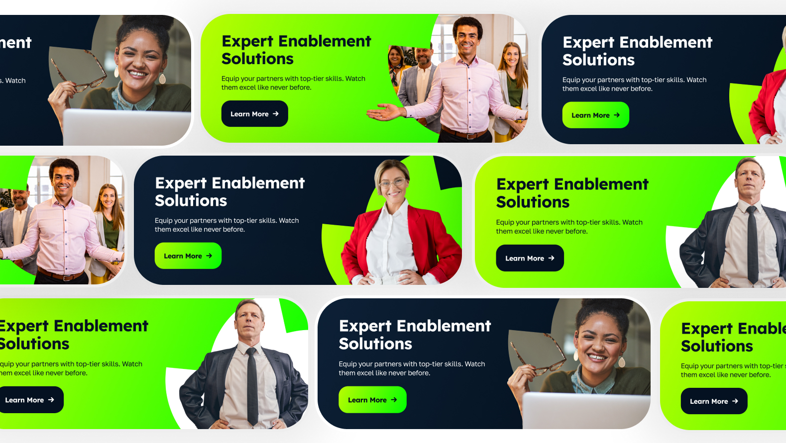
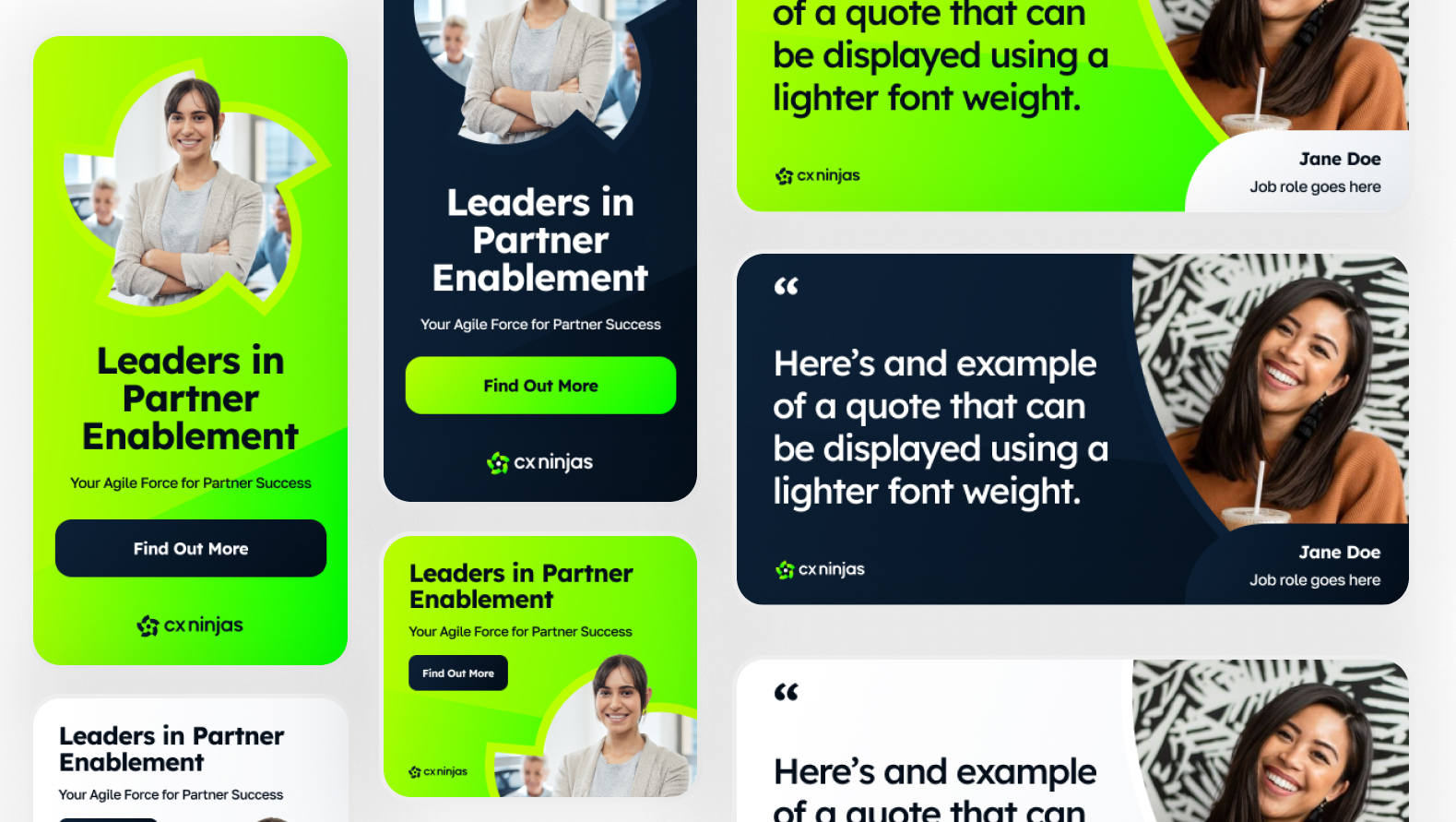
Alongside the website work, the visual foundation was applied across a range of branded marketing assets, including campaign materials, internal templates, and client-facing presentations. This ensured consistency across touchpoints and gave the team a flexible set of tools they could reuse and adapt without fragmenting the brand.
Together, the work provided CX Ninjas with a cohesive visual foundation and a clearer digital presence, giving internal teams the structure, assets, and direction needed to present ideas, services, and products with confidence.